
Web-Based Skeleton Type Design & Rendering Tool: Developing New Type Design Methodologies
Introduction
The design and reproduction processes of digital type have changed very little since the end of the bitmap type era of the 1960s and ‘70s. In fact, vector-outline based typefaces have been the de-facto standard since the mid-1980s. While this standard today has been informed by three decades of digital type design workflows, it is also important to note that these workflows are deeply divorced from the techniques of those type designers and lettering artists whose work is not produced in a digital context. The early engineering constraints of the personal computing era in concert with the necessities of PostScript and early digital publishing have in many ways limited the scope and capability of type design applications. Now, as the role of printed material in modern design workflows starts to fade, there are actually immense new opportunities to adapt these uniquely digital type production traditions in a way that allows for these digital methods of type design to achieve expressivity and dynamism rivaling that done by hand.
In this report, I am exploring from both a design and engineering perspective a new methodology that encompasses the four main stages of modern digital type creation—design, drawing, delivery, and reproduction—but approaches them from a new direction.
The Problem
In a traditional context, the core of a digital font is the Outline. The Outline, illustrated below represents the bounding shape of a typeface.
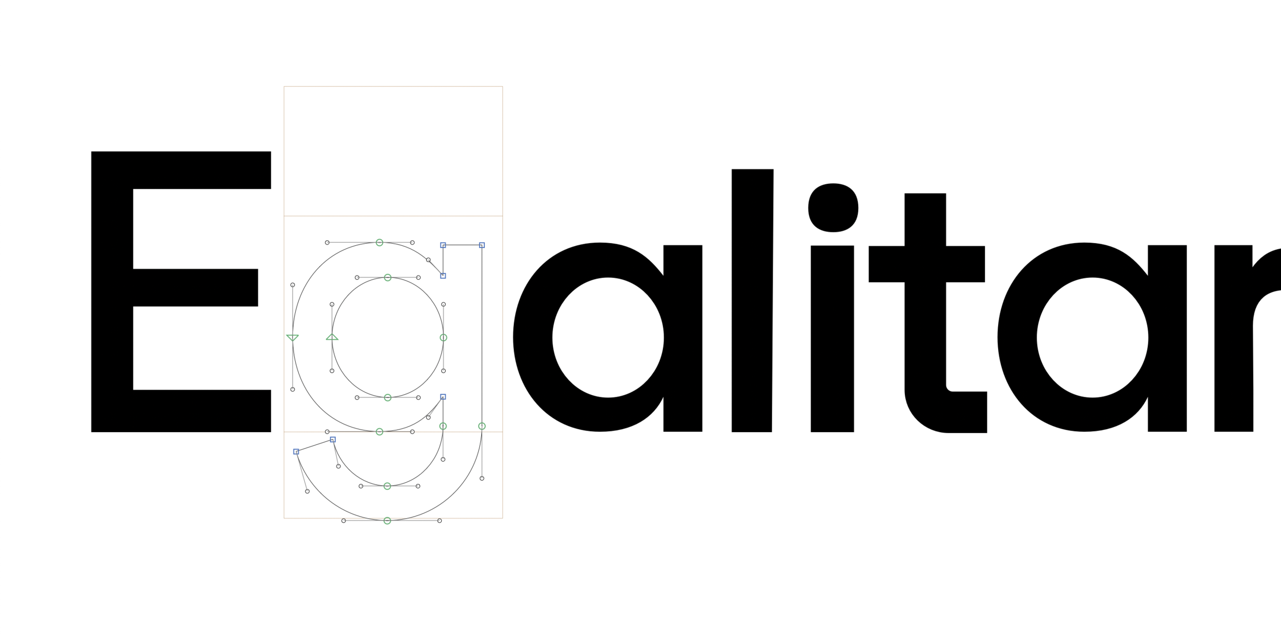
While the letters themselves are reproduced as solid shapes, these shapes are formed from an array of curves, lines, and points. While fonts are rarely conceptualized through the outlines, to be appropriately reproduced digitally, they are always drawn in this manner.
While this may not seem like a particularly big deal (especially for those who have a background in digital design and vector illustration), it actually presents a few major issues in the context of the larger workflow.
Weight
Think about any font you use on a regular basis...most likely, it has multiple Weights. Bold, Extra Bold, Black, Light, Thin, et cetera.
These weights, in a traditional font, exist entirely separate from one another— being drawn independently and sharing very little (from a data perspective) despite having clear visual ties to the rest of its family.
A type designer would traditionally have one of two options: to draw each character for each weight entirely from scratch, or to use a tool known as an interpolator. Interpolators allow you to provide the manually produced outlines for clear and distinct weights (such as Light, Regular, and Bold, for example), and generates in-between weights (such as Thin, or Semibold weights) to allow type designers to create deeply complex families without as much painstaking work.
As you would imagine, this differs vastly from the way a character's "weight" is produced in hand-lettering, where pressure, brush, and technique allow deeply variable (and efficient) control over the thickness of a shape.
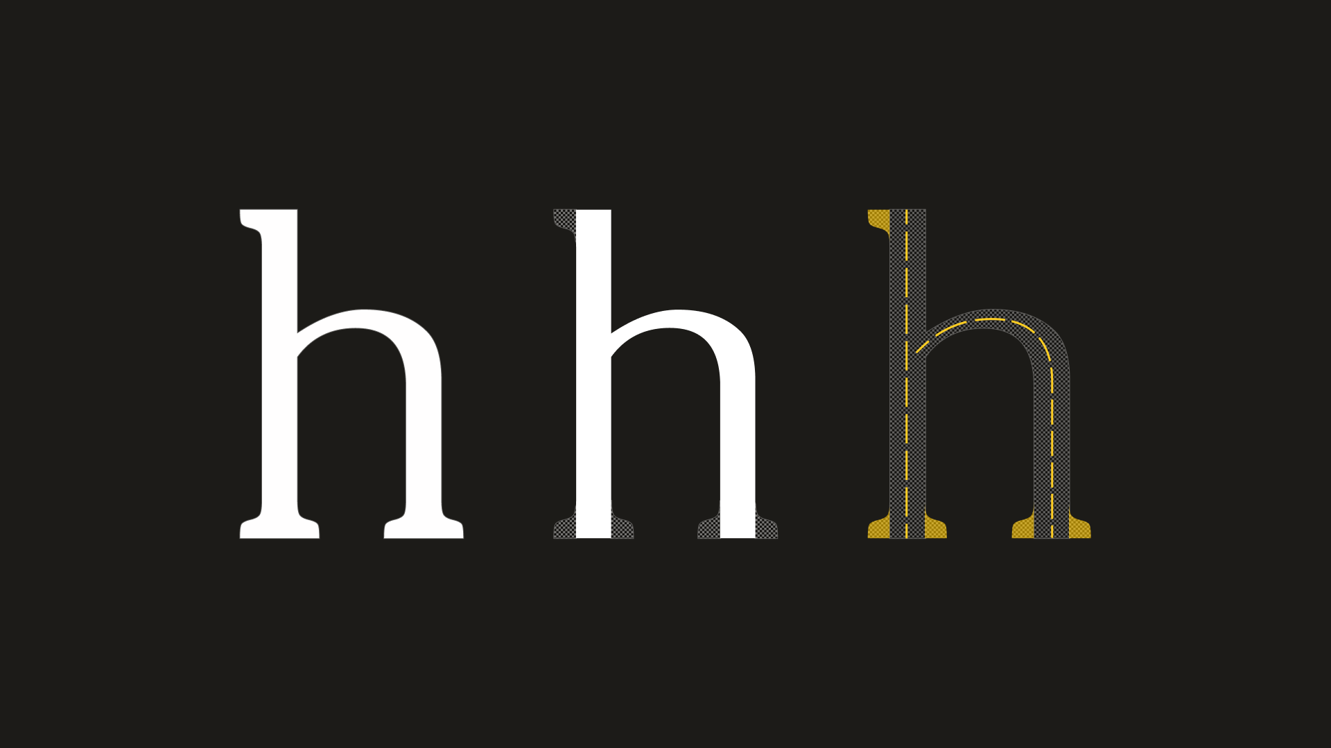
Reproduction
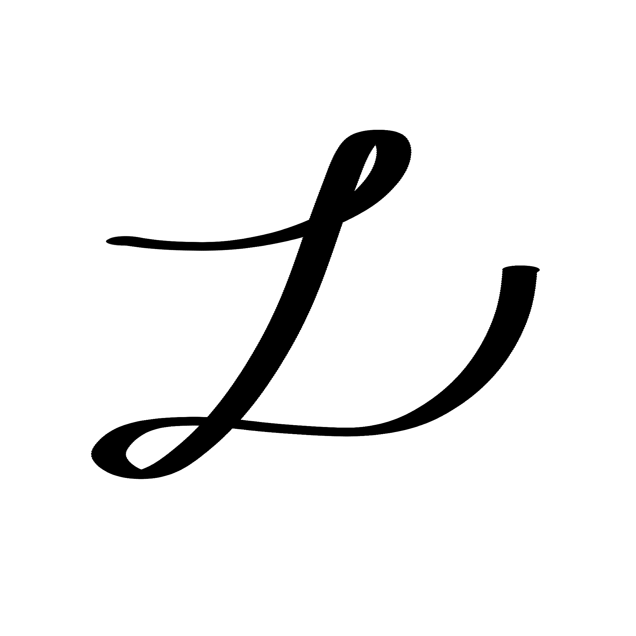
Let's take a look at the two characters shown below. Imagine that you, a type designer are tasked with recreating each as outlines.

The slab serif on the right is made up of mostly straight, consistently thick segments, making the production of outlines a much more efficient process. Being a style of typography that is grounded in industrial type and not written language, this makes sense. A script face, like the one shown on the left side however, is primarily made up of curved regions, and fluctuates between delicate thin segments and thick soft ones.
While clearly both of these are attainable, the reality is that all of the existing digital type design tools and methodologies are purpose built for typefaces closer to those on the right than on the left.
New Methodologies: “The Stroke”
Dutch designer Gerrit Noordzij, in his 2005 book "The Stroke: Theory of Writing" breaks down many of his thoughts on type, particularly in the context of written language. At the core of his philosophy on type is the importance of the Stroke. Strokes in his mind are conceptualized as motions, as opposed to the marks produced as a byproduct of those motions. While we see and process the marks themselves as written language, the motion of a stroke truly determines the character of a...well, character.
This idea, while relatively new, has influenced many type designers because it helps to address many of the issues that the digital type designers of today face in the production of expressive or highly variable fonts, leading to a few companies (most notably Letterink) taking the steps to produce software that leverages these ideas into a method called skeleton-based type design. In skeleton-based type design, the designer plans out the strokes that make up a typeface, and modifies parameters to produce it's visual representation (typically created through a conversion back to the more traditional outlines).
Blindspots
While there are a lot of advantages that come with these new techniques, they also leave a few key blindspots.
First, all of the existing tools work within other established outline-based type design tools. Second, There are no standards for encoding and reproducing skeleton or stroke-based typefaces. Third, type rendering as a whole is executed in a closed box—it is hard to understand why or how the software is making the decisions it does. Fourth, Expressivity in type design is still not solved on a user-experience level
In the process of building solutions, these are the primary features that I wanted to keep in mind: the user experience should leave room for expressivity in the design process, the type rendering infrastructure should be exposed, the project should be built on open technology, and it should run independently of any existing type design software.
Building Solutions
In trying to build solutions, the first point of focus was to determine how to actually create complex shapes from basic strokes. The previous goals set for this project as well as the want to have realtime demos and debugging led to the decision to build this type engine in JavaScript.
The Concept
For the first version, my concept was to take the ideas of "The Stroke" and skeleton-based type design and both expand and formalize them in the context of a "nib" and "pen" based type design model.
In the physical world, the shape of a brush or pen tip used in a stroke greatly affects the resulting marks. However, what makes these physical objects feel so expressive and dynamic are their responsiveness to angle, pressure, and medium (like ink, paint, or graphite). While digitally, medium makes less sense to try and replicate, angle and pressure are key.
In the case of a physically drawn glyph, like the one shown here, the angle at which the marker was held is crucial to recreating this shape digitally. For this reason, being able to control the width and angle of a nib was central to successfully executing this idea. It doesn't stop there, however. Effectively drawing the final shape required not only a nib, but an effective way of drawing strokes based on that nib.
There are two main methodologies for this: First, you can actually manually calculate the offsets of the Bezier curve used to encode the stroke. However, this limits you to relatively consistent widths across the shape. The other option is to generate a series of individually offset points from the Bezier curve, build a hull from those points, and use that hull to create an outline.
After testing, both methods were equally as fast, but the resolution was significantly better with the manual Bezier offset method. For that reason, I decided to follow-through with that method for the first version.
Version 1
The first proof-of-concept version, albeit simple, was created to demonstrate the viability of building this project on web frameworks.
This demo shown below displays a series of lines and curves, all with variable parameters, to test the "pen and nib" concept in a digital context.
Next Steps
While this demo definitely helped as a proof-of-concept, it was far from meeting all of the goals of this project.
First, while the resolution benefits of the Bezier offset method worked fine in this context, it is important to support largely irregular offsets in order to create complex features like Serifs and flared terminals.
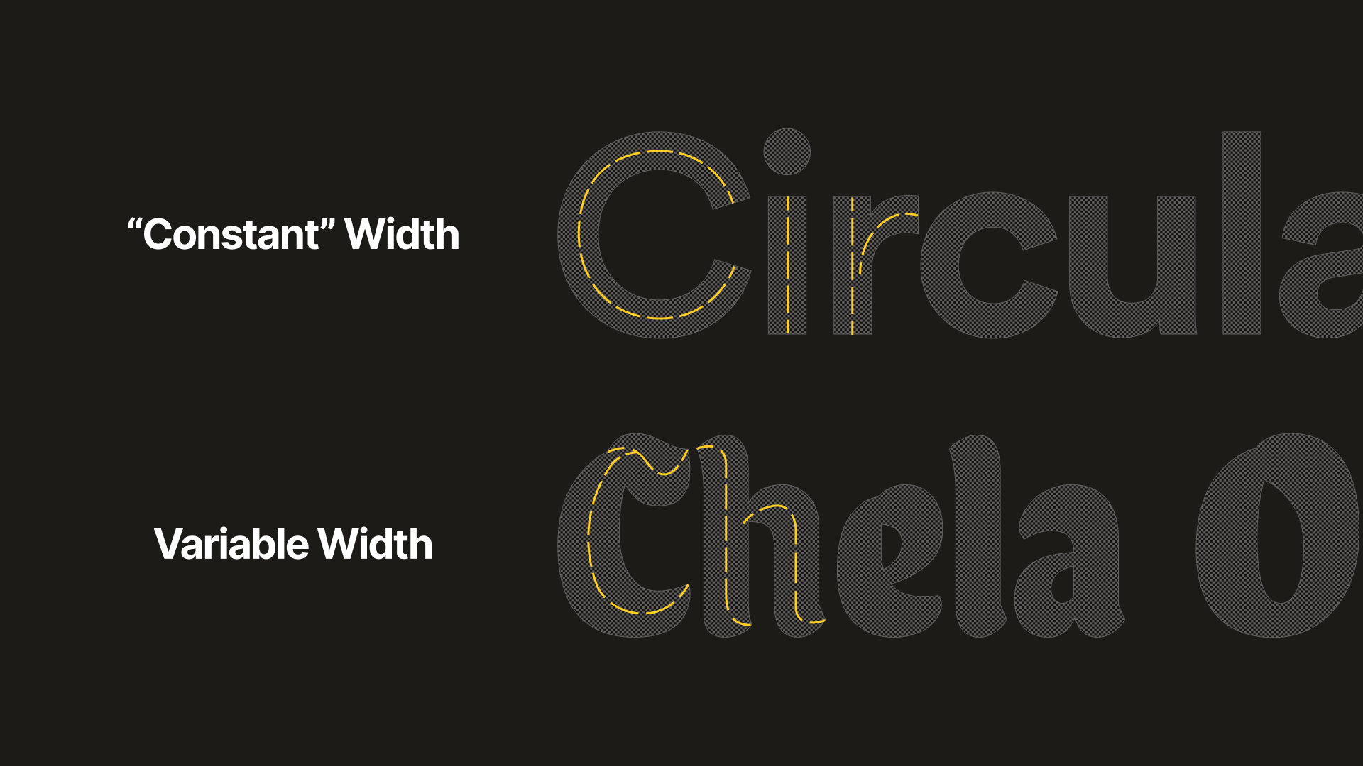
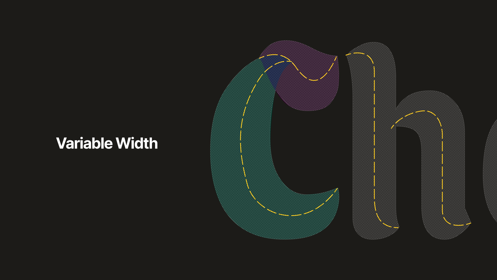
Variable Width Versus Fixed Width Characters
In addition, while this does handle the issue of rendering the forms, it does not touch on the issues of UX or Workflow necessary to facilitate actually drawing the forms.
Overview
For the second iteration, the primary focus was around how to effectively design a workflow that is not outline-centric, but still accessible to type designers and other digital designers. For this reason, this stage revolved primarily around conducting research and producing studies on ways of creating hybrid physical and digital typographic forms.
The first study of this type was to experiment with drawing different physical stroke techniques and overlaying them on a digitally generated stroke guide.
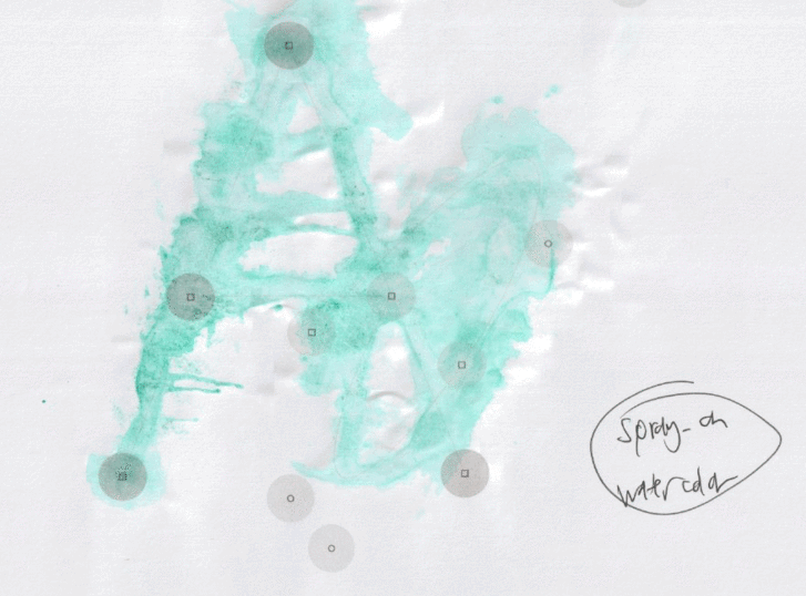
Animated cycle of the separate physical studies
The goal of this exercise was to be able to take the digital scans, and develop a methodology by which to extract parameters that would allow for a digital recreation of the overall style and form.
While there are a few possible ways of doing this, I wanted to avoid using learned approximations like those implemented with Machine Learning, as real-time performance was a primary goal in this context.
Conclusion
While this is where I left off at the end of my Directed Research, this is a project that I do plan on continuing going forward.
Knowing there things stand, the new priorities going forward are as such:
Explore how to effectively bridge physical and digital type workflows as a method of streamlining UX
Build a more efficient and powerful "pen and nib" engine for producing strokes
Explore alternative packaging and distribution techniques for variable and stroke-based fonts
The goals are the same as throughout:
Operation independent of existing type design software
Build open standards for encoding and reproducing skeleton or stroke-based typefaces
Make the type rendering engine as open and verbose as possible
Solve the accessibility issues of type design software from a UX perspective